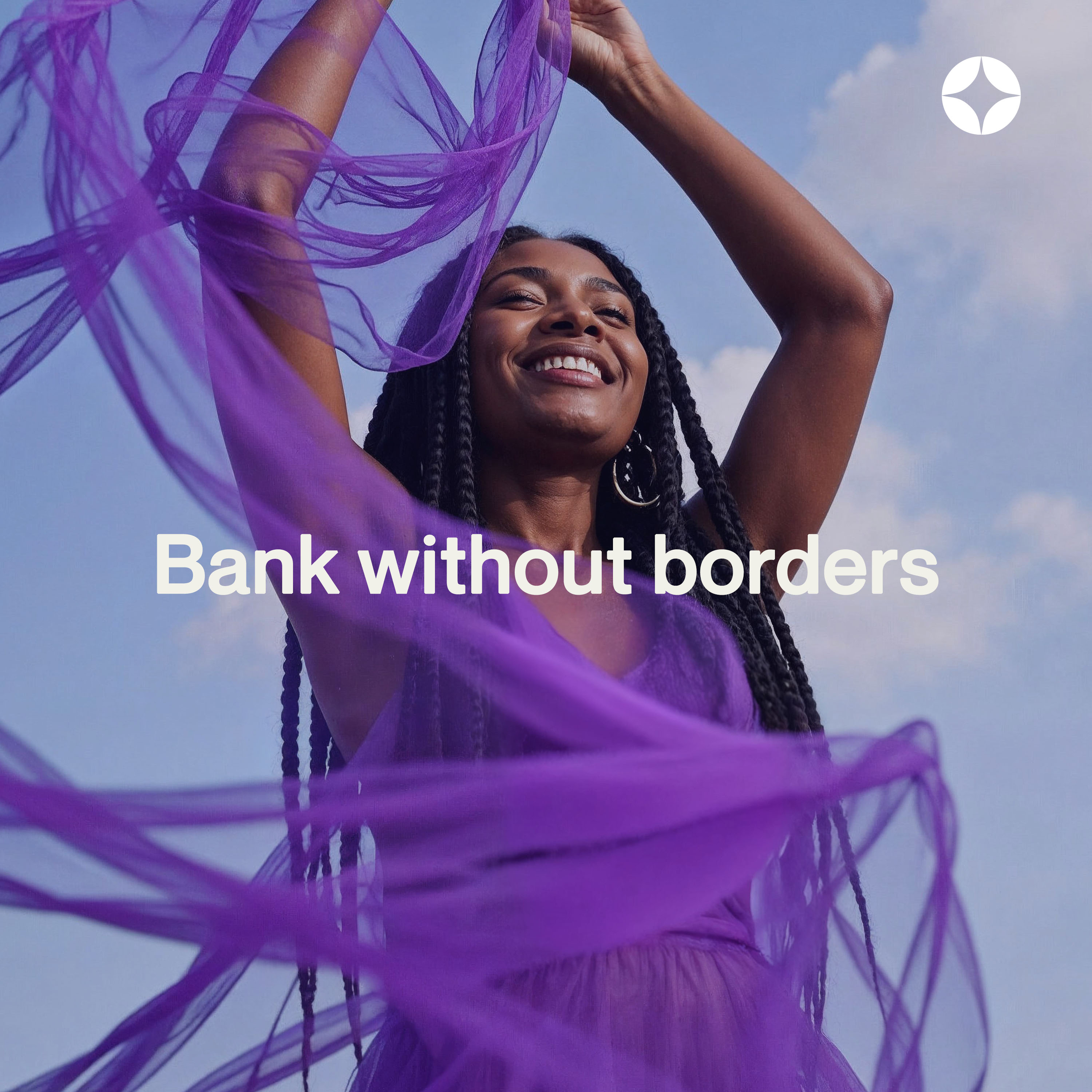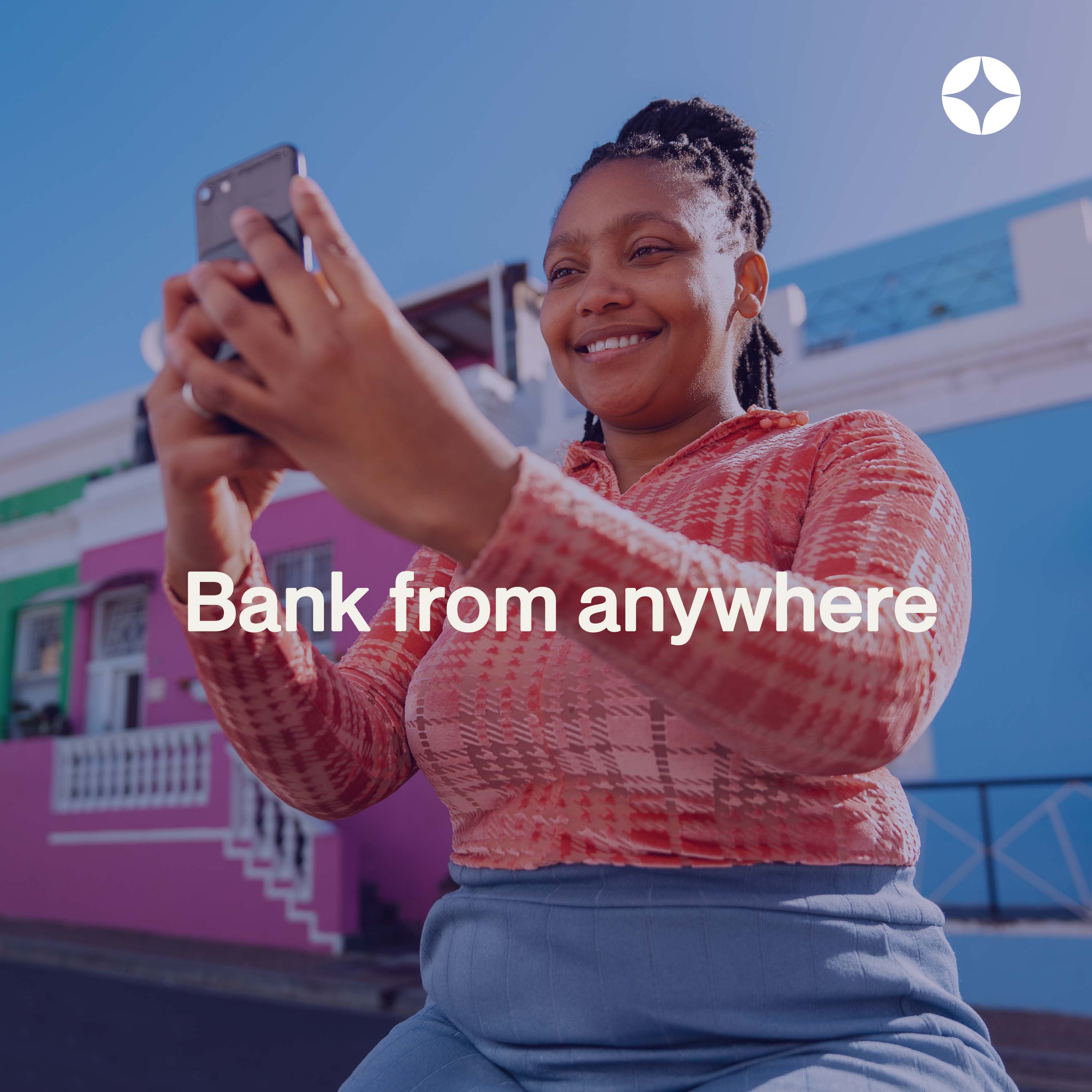
Nomad Bank was created for a new generation of people who live, move, and thrive across countries. Inspired by global citizens, digital nomads, and remote workers, the identity reflects finance that’s simple, inclusive, and flexible.
The new logo, a star-inspired mark, celebrates recognition and belonging , a symbol for those who often feel invisible in foreign systems. Paired with a bold, human wordmark, it positions Nomad as a financial partner built for people who don’t fit into one place or passport.
A system that travels with you
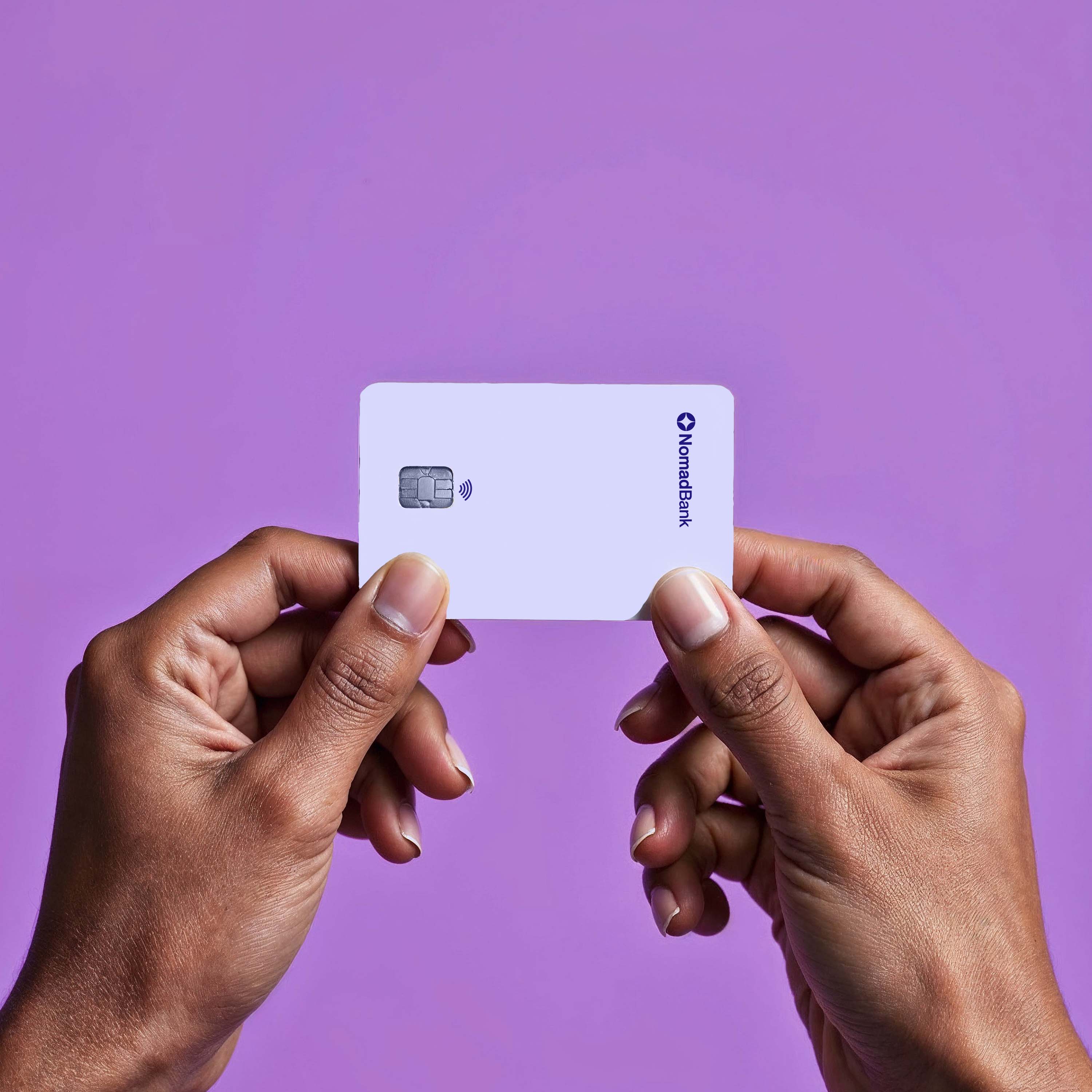
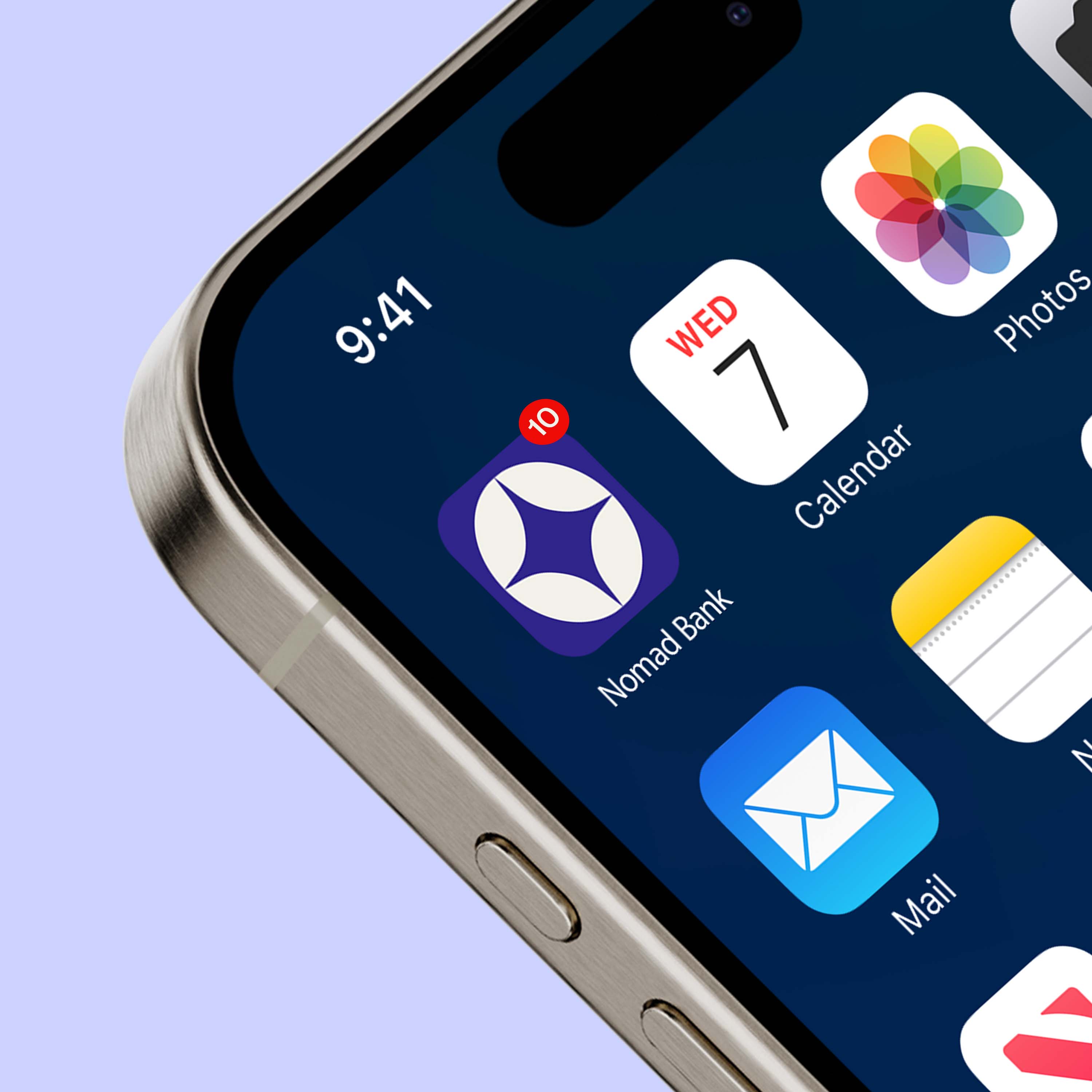
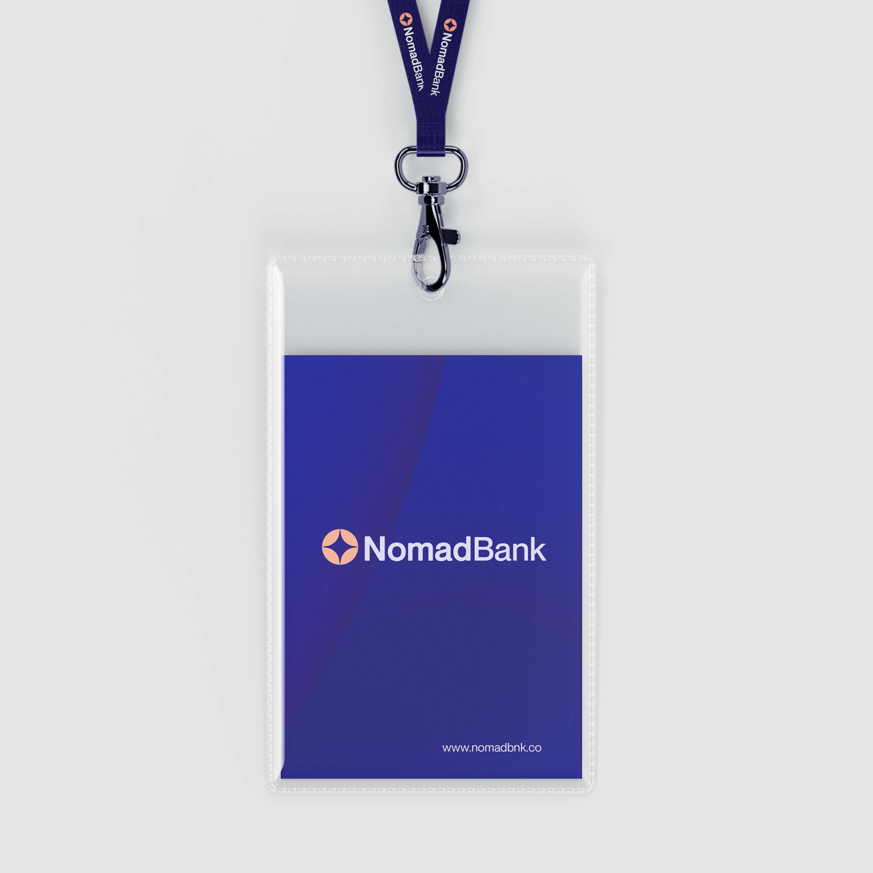
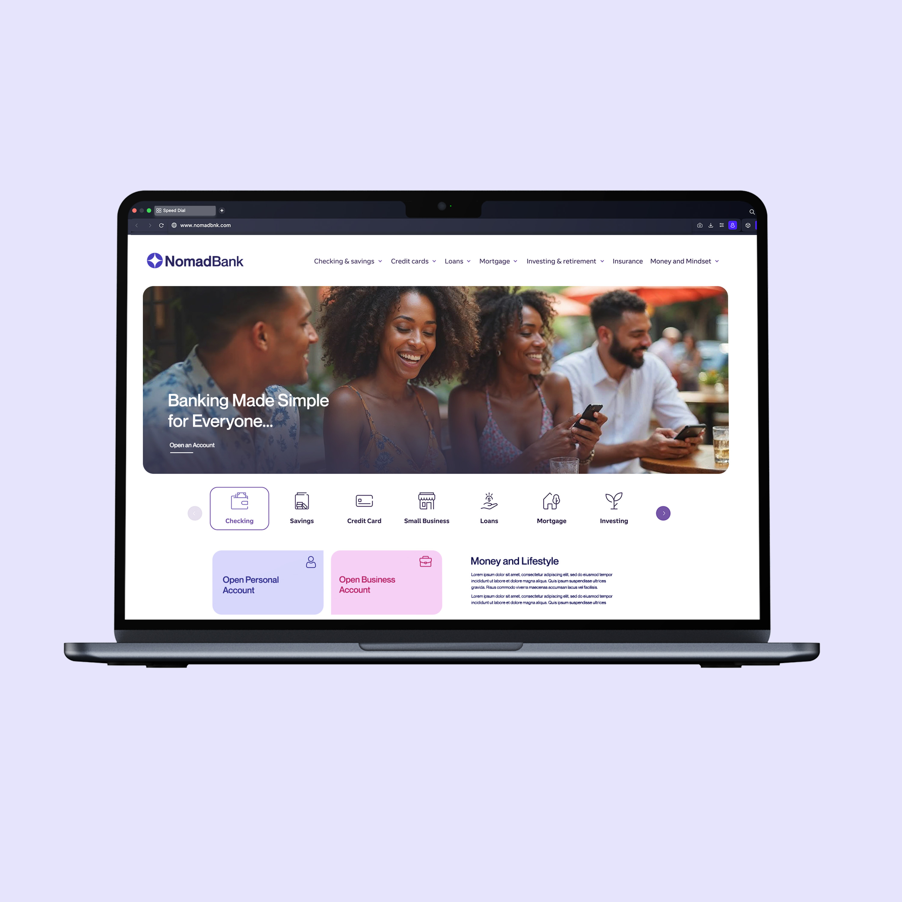
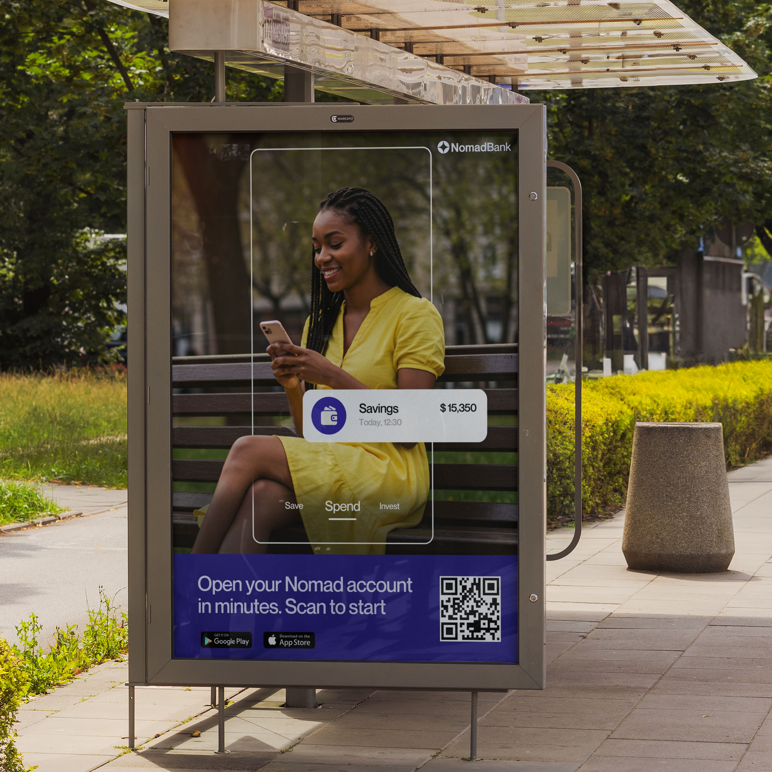
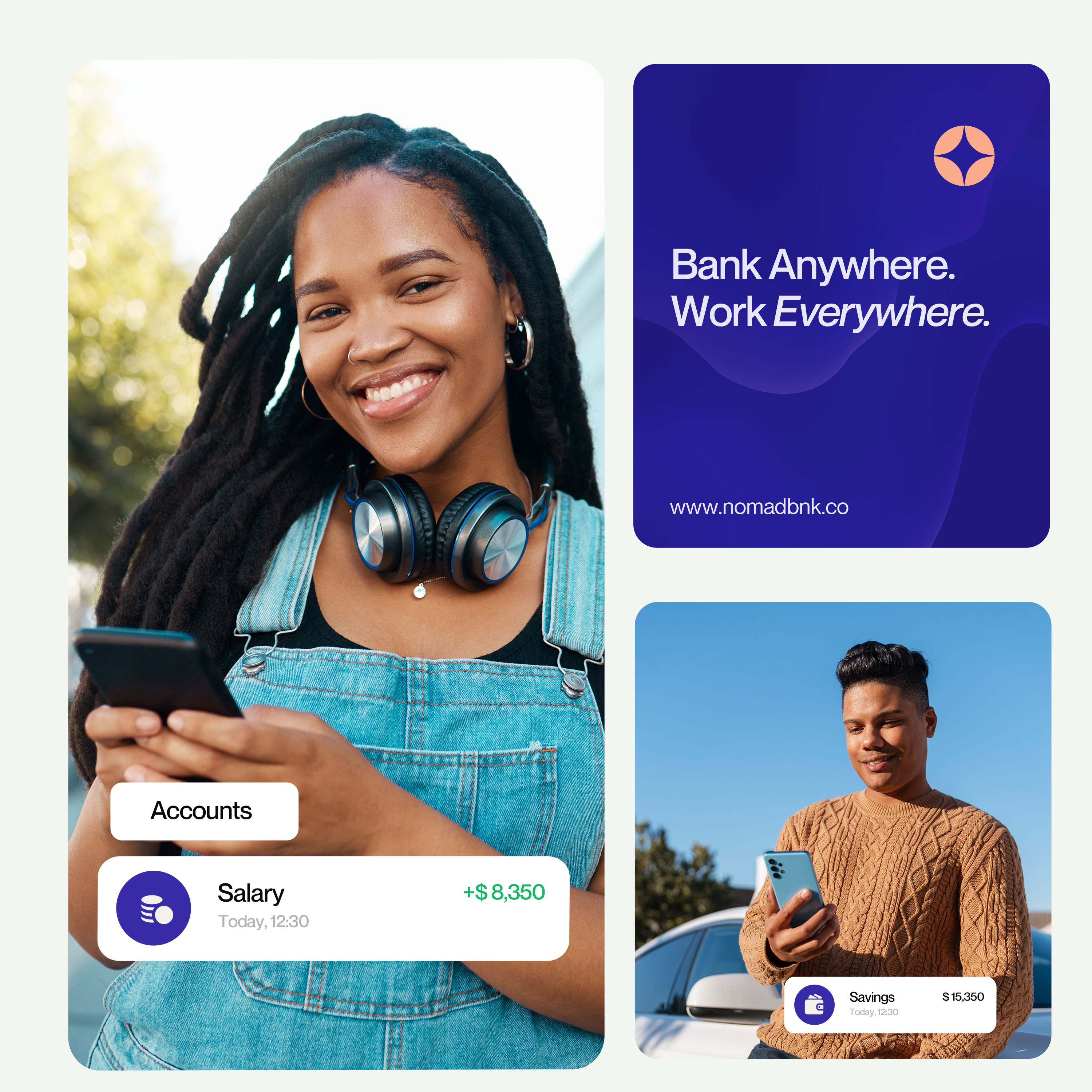
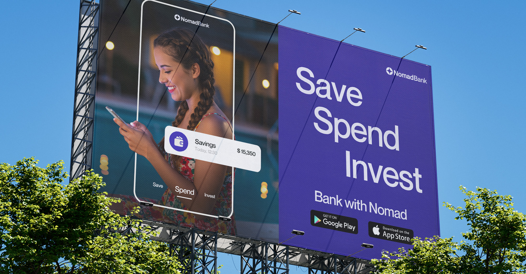
We developed a brand world designed to feel global yet personal. The color palette balances softness and confidence, appealing across cultures. Typography is clear, modern, and accessible. The design flexes seamlessly across digital and physical touchpoints , from debit cards to mobile screens to billboards , ensuring Nomad feels familiar whether you’re in London, Lagos, or Lisbon.
Deliverables & impact
While the project began as a conceptual exploration, our approach imagined a fully realized financial brand: logo, wordmark, typography, color direction, product UI, and branded assets. We designed mockups that demonstrate how Nomad shows up everywhere , in your wallet, on your phone, on the street.
More than a bank, Nomad represents belonging. The promise is simple: Wherever life takes you, you belong here.