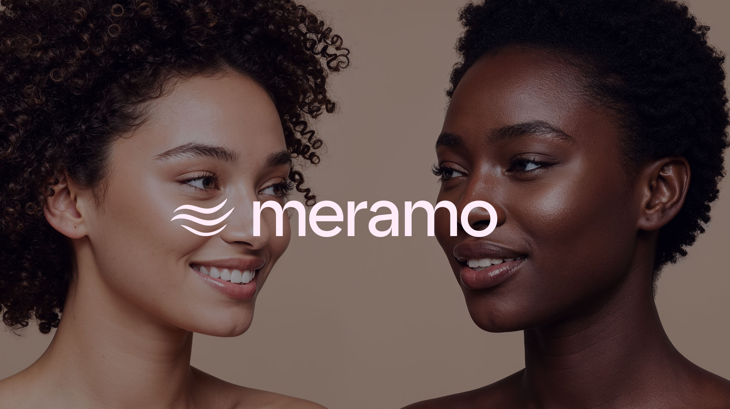
From beauty brand to modern identity
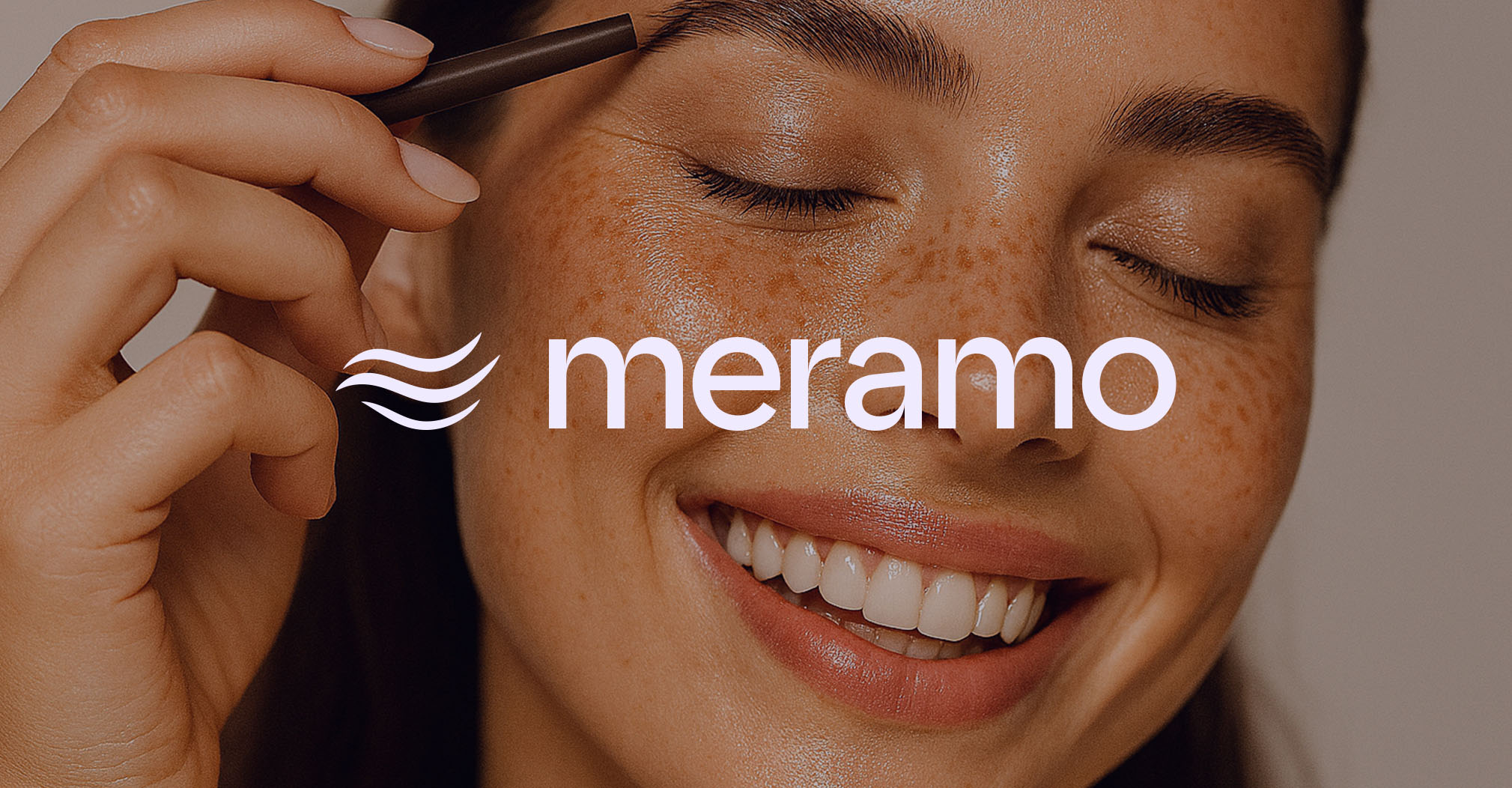
Meramo is a beauty brand built on three essential services: hair, nails, and brows. They approached us with the need for an identity that could unify their offerings while standing out in a saturated beauty market. The challenge was to design a system that felt premium, timeless, and versatile, something customers would instantly recognize and trust.
Designing symbols of care
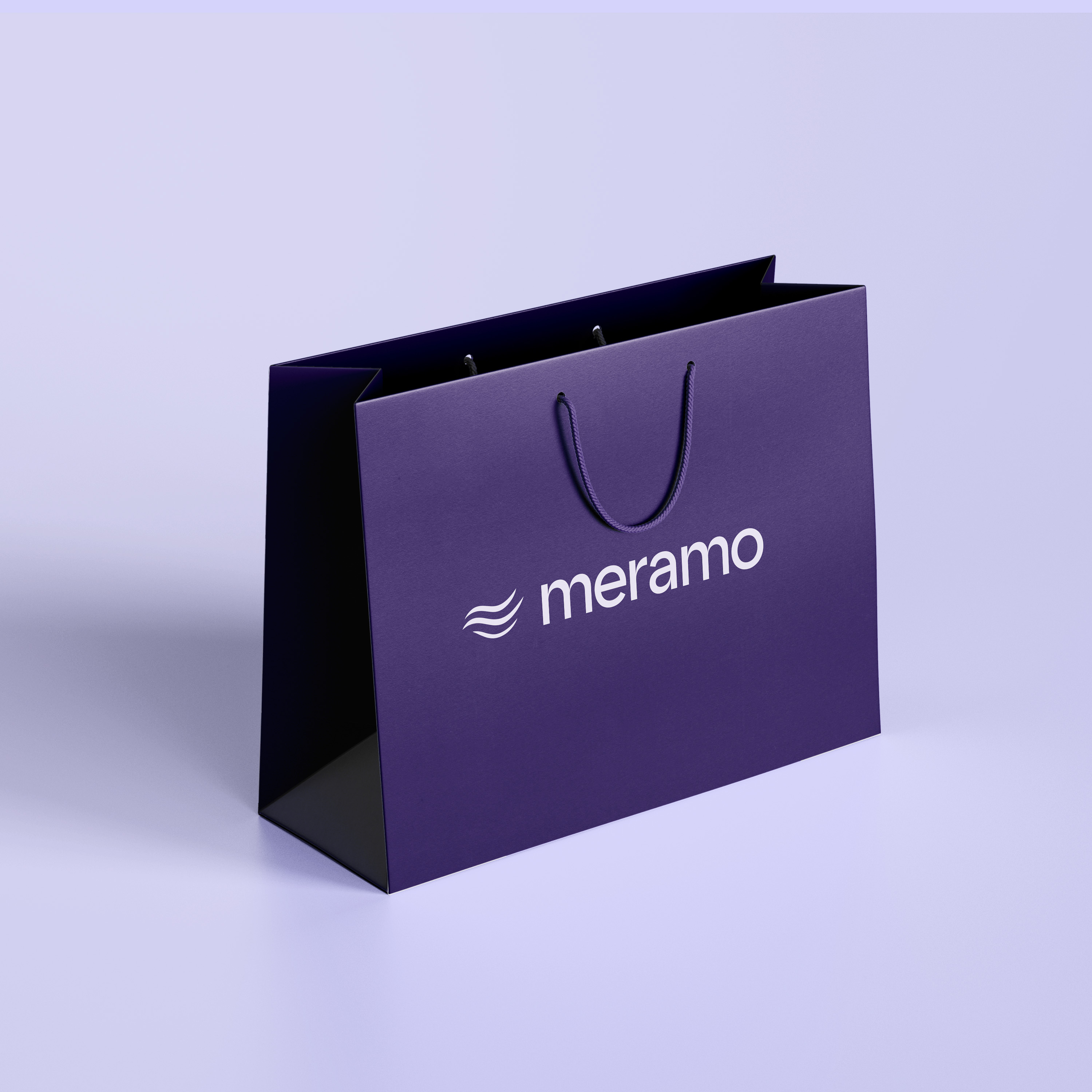
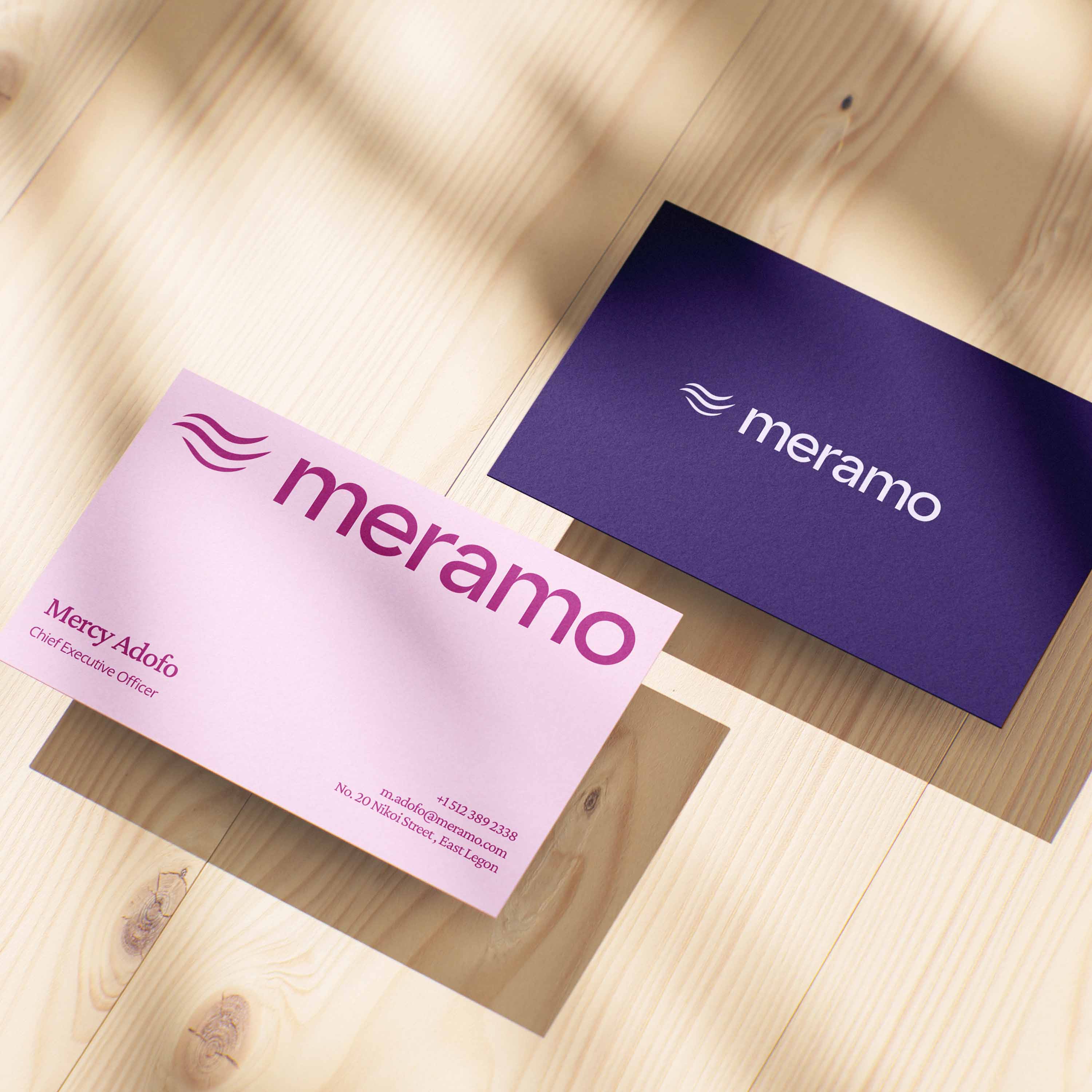
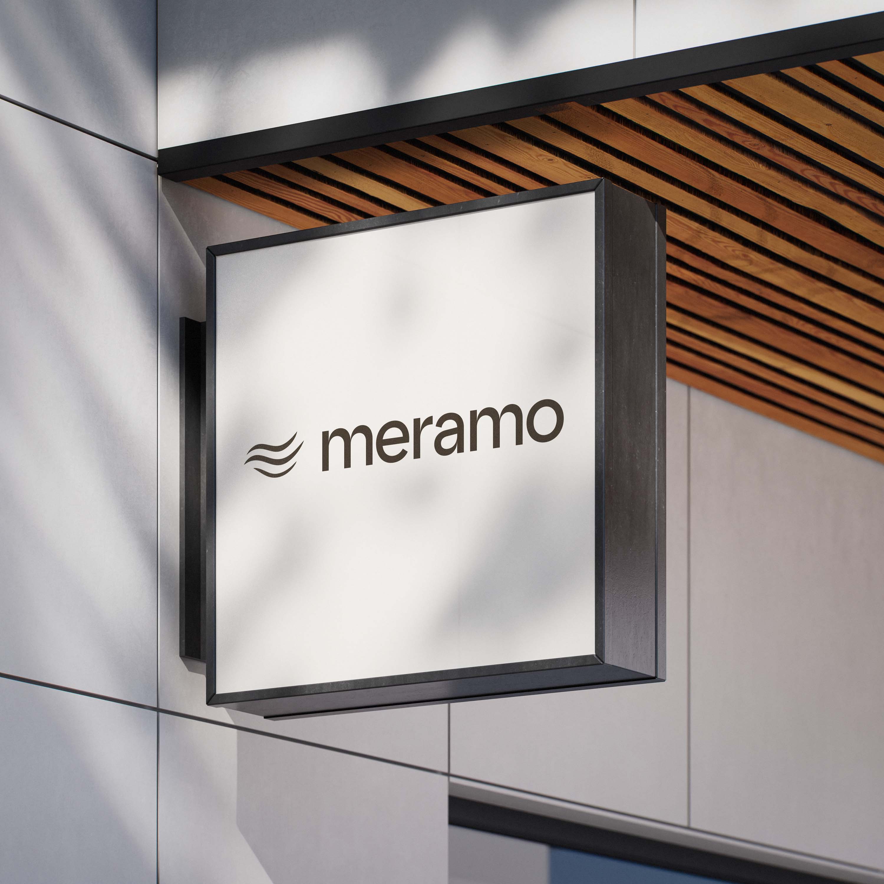
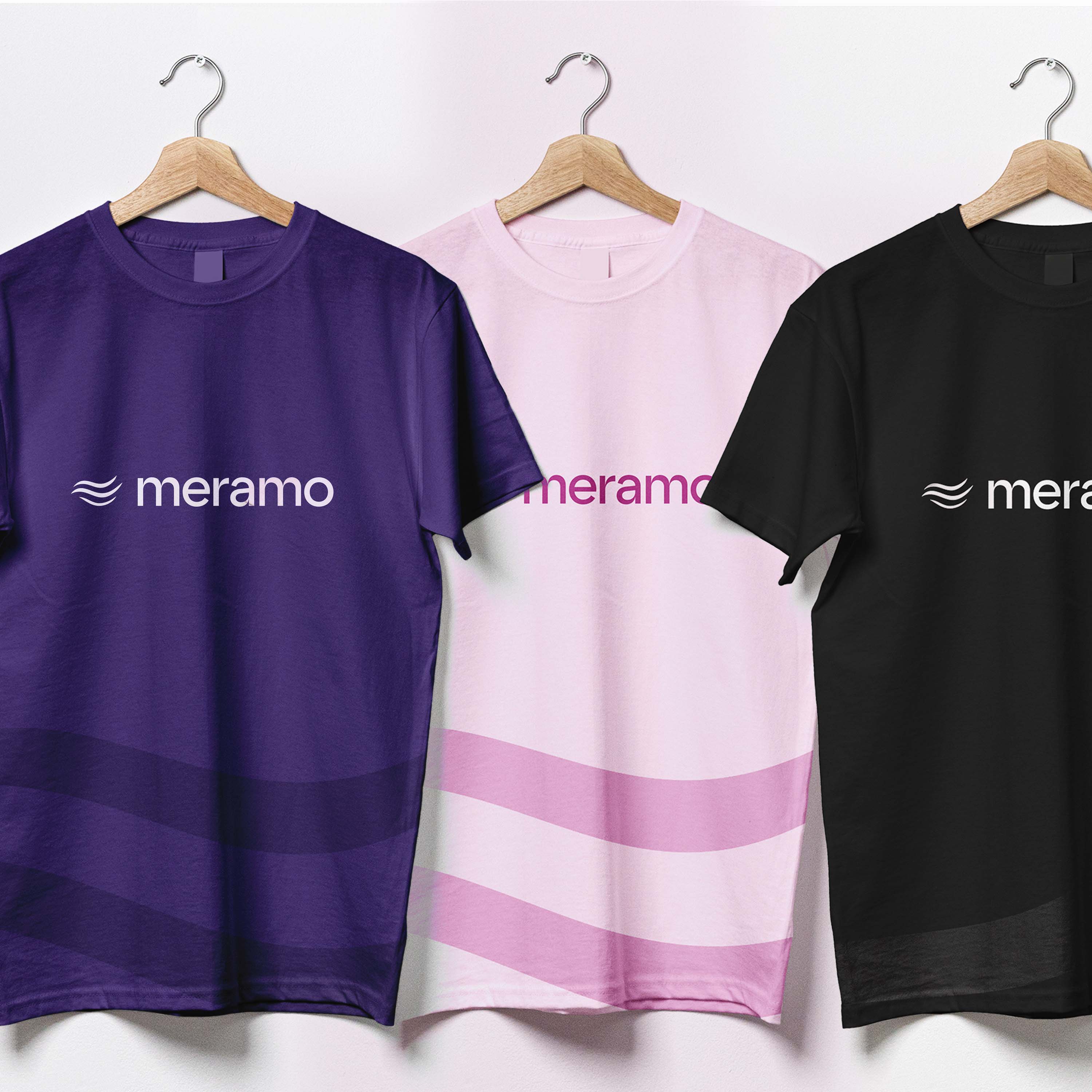
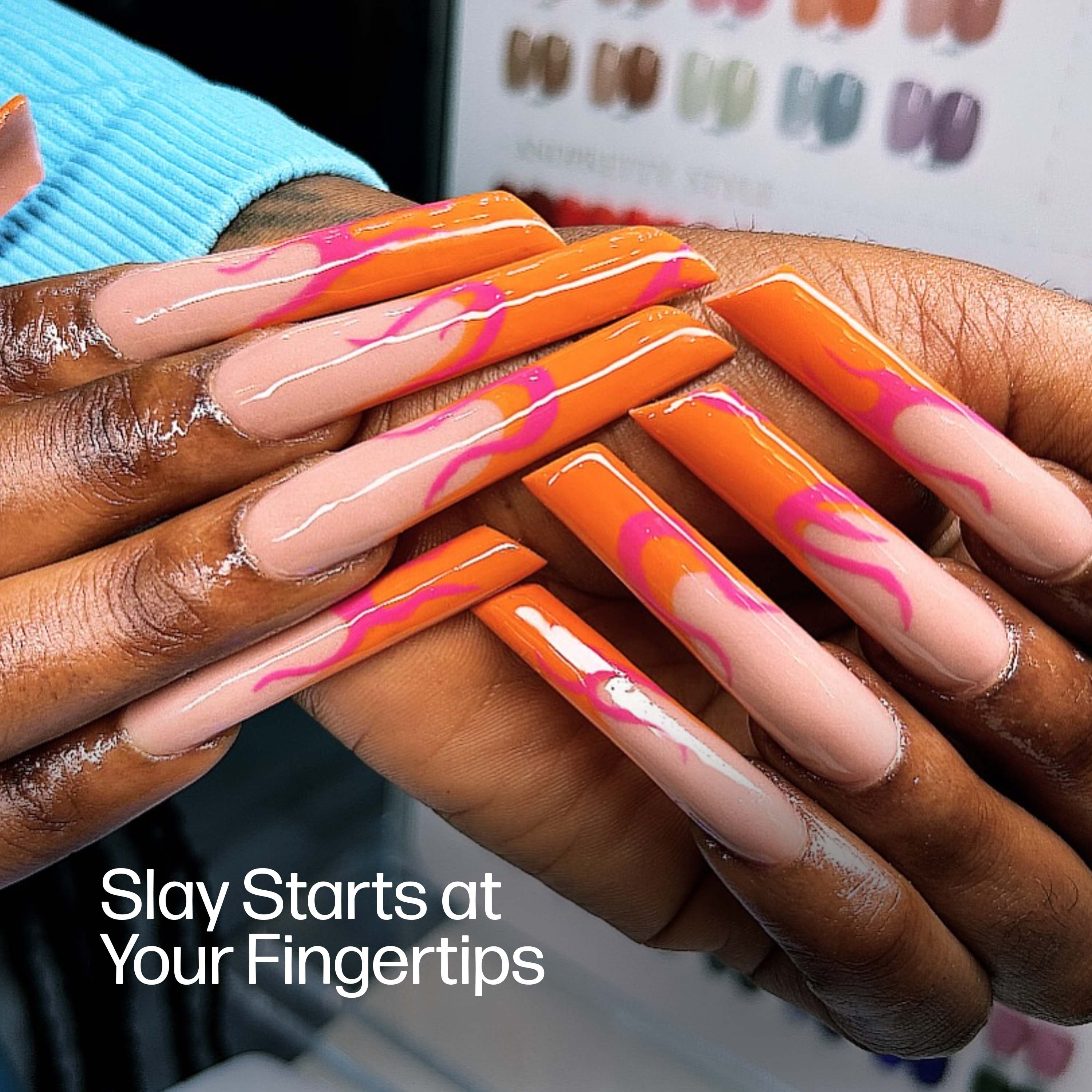
Our solution was to create a modular identity system anchored in three distinct yet connected icons: a flowing hair strand, a polished nail, and a defined eyebrow. Each icon represents one of Meramo’s core services while collectively forming a cohesive visual language. Together, they convey elegance, self-expression, and the artistry of personal care.
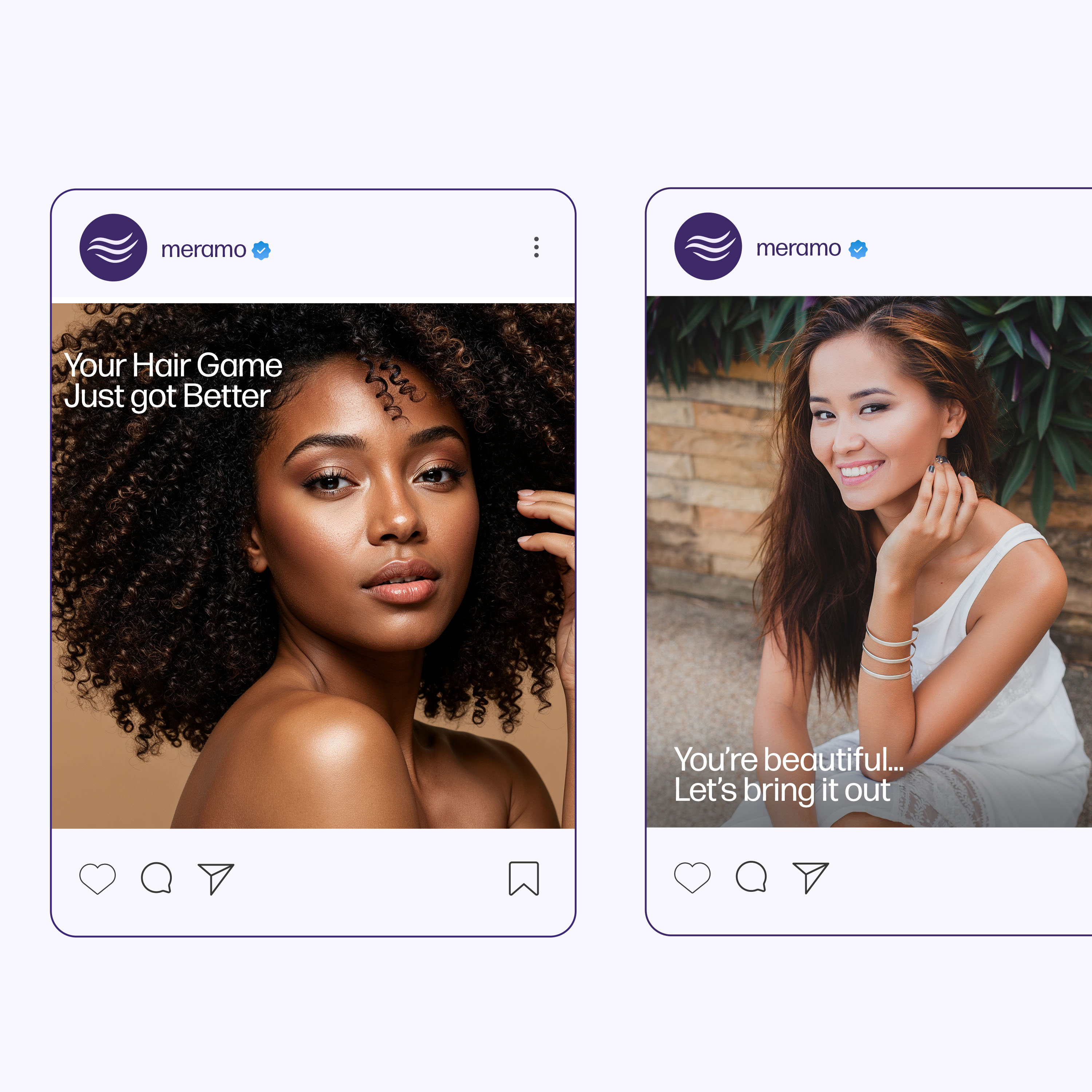
An identity that feels personal and premium
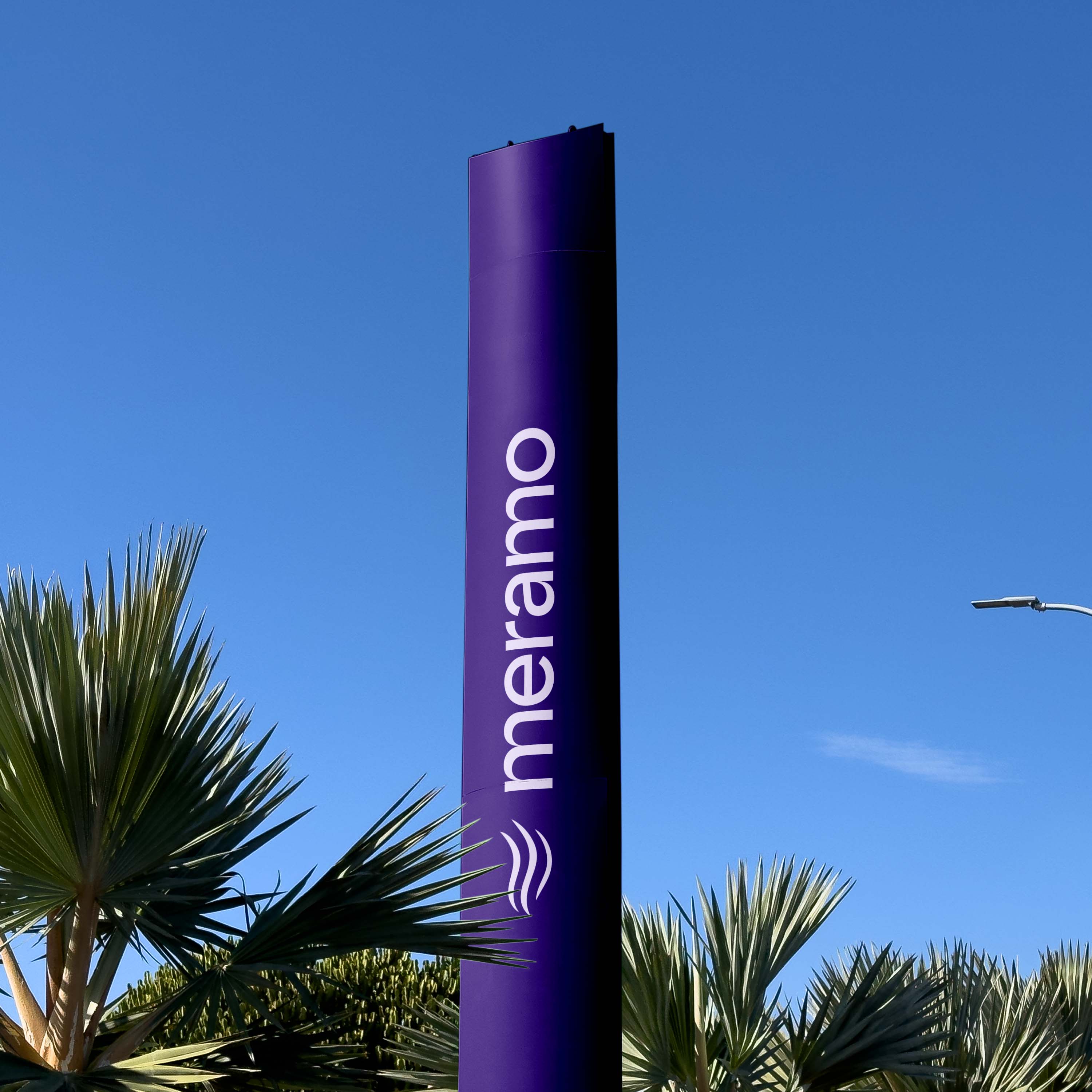
The logomark is clean and modern, complemented by typography that balances softness with confidence. A refined color palette adds warmth and sophistication, ensuring the identity resonates across digital platforms, product packaging, and in-store environments.
Deliverables & impact
The result is a flexible identity system that gives Meramo a distinct presence while honoring the details of the beauty experience. It communicates not only what Meramo does, but also how it makes people feel: confident, refined, and seen.